Note: For an October 2021 update, go to “The Wealth Gap Widens.”
Year-old statistics about America’s wildly growing wealth gap have been animated in a recent You Tube video that’s gone viral: over 5,650,000 views the last few days. Take a look Here.
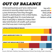
Based mainly on work attributed to a “Harvard business professor and economist,” and reported by Mother Jones in 2012, the video walks us through (1) what Americans believe our current wealth distribution is, (2) what they believe an ideal distribution should be, and (3) what that distribution actually is today. The differences between (1) and (2) are significant, but the difference between these two and number (3) are stunning. Few have very little idea of how out of whack—how terribly unequal—wealth distribution and income inequality have become.
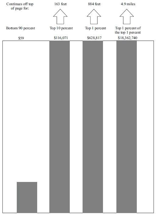
But for me the most stunning graphic remains the chart below, a chart constructed by David Cay Johnson, winner of a Pulitzer Prize for his coverage of tax policy when he was with the New York Times. Now a professor at the Syracuse University College of Law and author of three books about taxes—Free Lunch, Perfectly Legal, and The Fine Print—Johnson based his chart on statistics compiled by Saez and Piketty from IRS data.
It works this way. From 1966 to 2011 real income for 90% of Americans grew by just $59, while income grew $116,071 for the top 10% of Americans, $628,817 for the top 1% of Americans, and $18,362,740 for the top 1% of that top 1%. You can get figures roughly the same from many sources, and analyses of the causes for such gigantic inequalities also from many sources, the most astute one, I believe, being Jacob Hacker and Paul Pierson’s book Winner-Take-All Politics: How Washington Made the Rich Richer—And Turned Its Back on the Middle Class.
Now, let that $59 growth for 90% of Americans equal one inch on a chart that, in order to fit on half of a normal 8.5″ x 11″ piece of paper, we’ve made 5.5″ tall.
The $59 line—the first vertical line on the chart below, the one on the left—fits “comfortably” in its place, of course.
However, the next line, representing the top 10%, would have to go 163 feet off the chart to represent the $116,071 income growth for that segment of Americans. The next line, representing the income growth of the top 1%, would go 884 feet off the chart.
But the last line, representing the income growth of the top 1% of the top 1% would go 4.9 MILES off the chart. One inch vs. more than 4.9 miles.
Pile in all the synonyms for “stunning” and “gigantic” you want, and maybe add ones for “obscene,” depending upon your political persuasion, and language would still seem inadequate to express what should be astonishment no matter who you are—even if you’re part of that 1% of the top 1%. What to do? Anything? It’s got to be “discouraging” (plus synonyms) for us 90-percenters. But possible solutions begin with awareness. Over 5,650,000 views of the video above could begin to look like a glimmer of hope, faint as it still is.
♦ Read about Emmanuel House, the Guzman’s “family” foundation—it’s grown far beyond the family by now—honored as one of the “Top 100 Most Innovative” social change organizations in the world for its efforts to fight against this growing wealth gap.
Graphic Inequality
Note: For an October 2021 update, go to “The Wealth Gap Widens.”
Year-old statistics about America’s wildly growing wealth gap have been animated in a recent You Tube video that’s gone viral: over 5,650,000 views the last few days. Take a look Here.
Based mainly on work attributed to a “Harvard business professor and economist,” and reported by Mother Jones in 2012, the video walks us through (1) what Americans believe our current wealth distribution is, (2) what they believe an ideal distribution should be, and (3) what that distribution actually is today. The differences between (1) and (2) are significant, but the difference between these two and number (3) are stunning. Few have very little idea of how out of whack—how terribly unequal—wealth distribution and income inequality have become.
But for me the most stunning graphic remains the chart below, a chart constructed by David Cay Johnson, winner of a Pulitzer Prize for his coverage of tax policy when he was with the New York Times. Now a professor at the Syracuse University College of Law and author of three books about taxes—Free Lunch, Perfectly Legal, and The Fine Print—Johnson based his chart on statistics compiled by Saez and Piketty from IRS data.
It works this way. From 1966 to 2011 real income for 90% of Americans grew by just $59, while income grew $116,071 for the top 10% of Americans, $628,817 for the top 1% of Americans, and $18,362,740 for the top 1% of that top 1%. You can get figures roughly the same from many sources, and analyses of the causes for such gigantic inequalities also from many sources, the most astute one, I believe, being Jacob Hacker and Paul Pierson’s book Winner-Take-All Politics: How Washington Made the Rich Richer—And Turned Its Back on the Middle Class.
Now, let that $59 growth for 90% of Americans equal one inch on a chart that, in order to fit on half of a normal 8.5″ x 11″ piece of paper, we’ve made 5.5″ tall.
The $59 line—the first vertical line on the chart below, the one on the left—fits “comfortably” in its place, of course.
However, the next line, representing the top 10%, would have to go 163 feet off the chart to represent the $116,071 income growth for that segment of Americans. The next line, representing the income growth of the top 1%, would go 884 feet off the chart.
But the last line, representing the income growth of the top 1% of the top 1% would go 4.9 MILES off the chart. One inch vs. more than 4.9 miles.
Pile in all the synonyms for “stunning” and “gigantic” you want, and maybe add ones for “obscene,” depending upon your political persuasion, and language would still seem inadequate to express what should be astonishment no matter who you are—even if you’re part of that 1% of the top 1%. What to do? Anything? It’s got to be “discouraging” (plus synonyms) for us 90-percenters. But possible solutions begin with awareness. Over 5,650,000 views of the video above could begin to look like a glimmer of hope, faint as it still is.
♦ Read about Emmanuel House, the Guzman’s “family” foundation—it’s grown far beyond the family by now—honored as one of the “Top 100 Most Innovative” social change organizations in the world for its efforts to fight against this growing wealth gap.